Mets News
Latest
Edwin Díaz Blows First Save Since 2022, Mets Swept By Rays
Following losses in the initial two games of the series, the New York Mets (16-18) aimed to clinch victory in the Sunday afternoon finale against the Tampa Bay Rays. While the offense managed to score when necessary, it fell short as the bullpen faltered in the late stages, resulting in a 7-6 defeat and a sweep by the Tampa Bay Rays. Right from the start, Francisco Lindor gave the Mets an early...
Mets Thoughts
Latest
Jose Quintana’s Struggles Run Deeper Than Just His Last Start
Entering the season, arguably the biggest question mark surrounding the New York Mets was their starting rotation. After beginning the season strong, the unit has regressed mightily to where several feared it may project to be prior to the season. Specifically, prior to Saturday’s game, the unit ranks 21st in staff ERA (4.34) and 20th in staff WAR (1.8). Earlier on in the season, these...
Mets Minors
Latest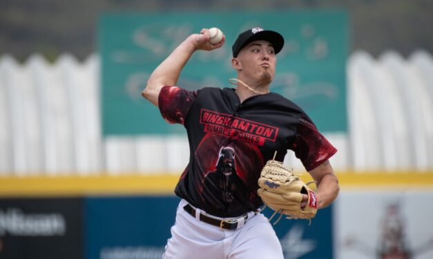
Blade Tidwell, Nolan McLean Dominate On The Mound
The starting pitching in Binghamton (Double-A) and Brooklyn (High-A) impressed on Saturday. Blade Tidwell threw eight scoreless innings with nine strikeouts while Nolan McLean went five scoreless innings with nine strikeouts. Meanwhile, the Florida Complex League opened its season Saturday afternoon. Triple-A Syracuse Mets (17-13) 4, Rochester Red Wings (14-14) 2 BOX SCORE DH Rylan Bannon...
Interviews
Latest
MMO Weekly Episode 72: Mets Pitching Prospect Paul Gervase
Mets fans, an all-new episode is here! This week I’m joined by Mets pitching prospect Paul Gervase! We had some great discussions about his 2023 season and experiencing a playoff run with Binghamton, how biomechanics and other training have taken him from a little-known division three player to LSU and eventually to the professionals, expectations for the 2024 season, and much more! What...
Fan Shot
Latest
Fan Shot: Mets Should Still Consider 6-Man Rotation
This fan-shot is by Tom Sokol Baseball’s starting pitchers are throwing harder and getting injured at a higher rate than ever before. Starting pitcher innings and pitch counts are decreasing year after year. Something needs to change in baseball around the starting pitcher, and one possibility is the idea of a six-man rotation. We already see six-man rotations in Japan, and we saw it in...
MLB News
Latest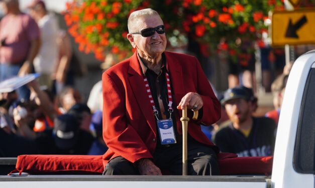
Hall of Fame Manager Whitey Herzog Dies at 92
Whitey Herzog, a Hall of Fame manager who led the St. Louis Cardinals to three World Series and the 1982 championship and worked for the Mets as a coach and director of player development from 1966-1972, has died. He was 92. “Whitey spent his last few days surrounded by his family,” the Herzog family said in a statement released through the Cardinals. “We have so appreciated...
Podcasts
Latest
MMO Weekly Episode 77: Tim Britton Talks Mets Early Struggles
The Mets have started the 2024 season 0-4, followed by multiple postponements, and fans are understandably restless. Tim Britton of The Athletic joined MMO Weekly to talk about the Mets’ early-season struggles. Britton also discusses the state of the Mets starting rotation after the signing of Julio Teheran to a major league deal. Make sure to subscribe to the show on YouTube and follow us...
Mets History
Latest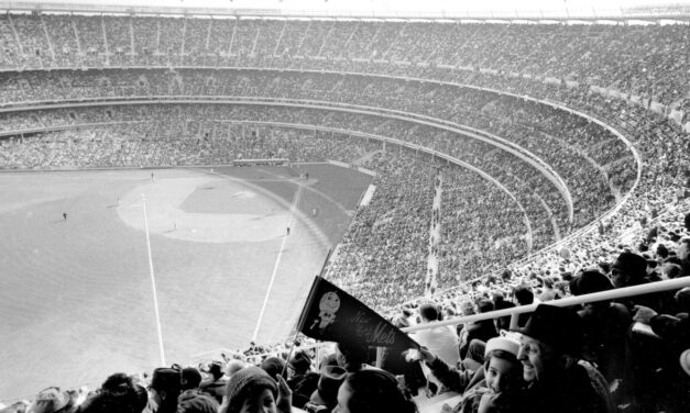
60 Years Ago: First Game at Shea Stadium
In it’s 45-year history, Shea Stadium played host to baseball, football, boxing, soccer, the pope, The Who, and The Beatles. It started 60 years ago today with the team that called Shea home for its entire existence. The Mets and Pirates opened the multi-purpose facility on a Friday afternoon in conjunction with the nearby World’s Fair, despite the park not being fully complete. The...