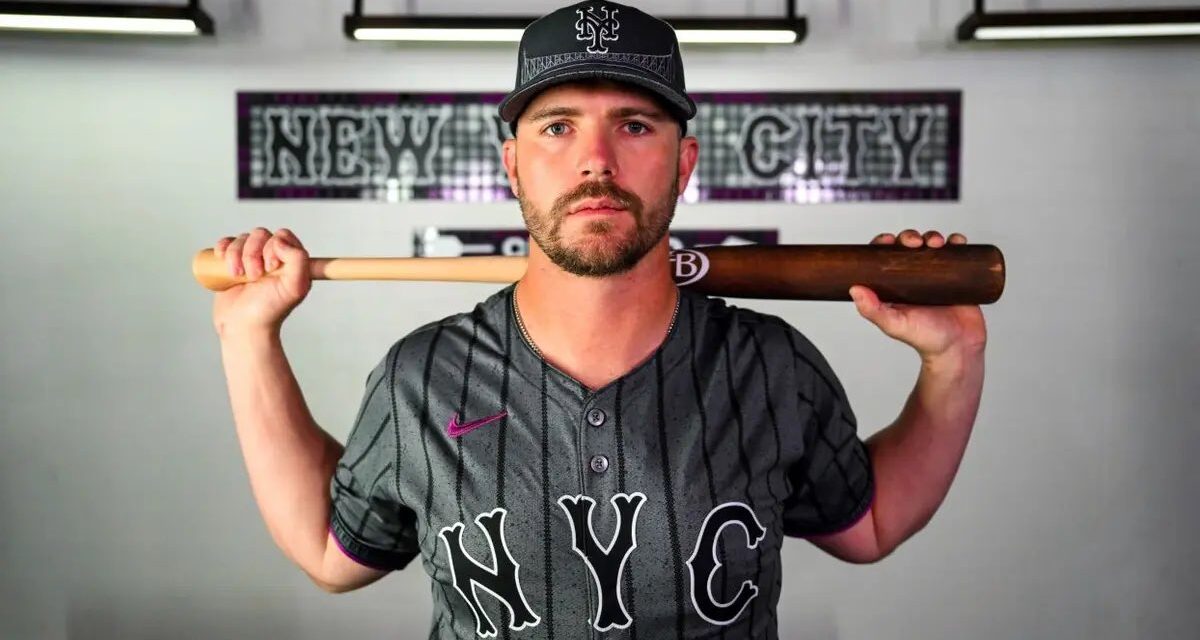
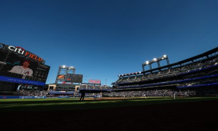
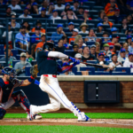
By now, you’ve seen the Mets City Connect uniforms. Do you love them? Have you already ordered some swag from their line? Or maybe you hate them. Or are you not entirely sure how you feel about them? Whatever you’re feeling, we feel it too—well, at least one of us does. We here at Metsmerized are sharing what we really think about the Mets City Connect uniforms.
Andrew Steele-Davis
Prior to Friday, there were only a couple of City Connect uniforms I really liked, including the Rockies’ really cool design. After Friday, the Mets have joined Colorado in having the best City Connect jerseys in baseball. I was really worried about how the Mets’ City Connects would turn out, but it is evident that a hell of a lot of thought went into them. They do a stellar job of representing New York, and the hat is beyond cool. It is the kind of jersey you could get away with wearing in a casual setting, and I really like that the sizing of the letters and the numbers on the back of the jersey look similar to what we were used to last year, as opposed to the abject horror show Nike / Fanatics have produced this year.
My only small critique is I wish Queens was on the front, and more purple would have looked cool. But, overall, really, really nice job on these and I think they will prove popular.
Matt Mancuso
In a time period where rebrands and new uniforms have dominated headlines for all the wrong reasons (see GuarenteedRate Field), the Mets City Connect jerseys represented a breath of fresh air. I personally enjoy the intricacies of the cap; consider me a fan of how the designers wove the color of Queens’ most important subway line into the material. While I have minor gripes with the uniform, I personally think this is one of the stronger City Connect uniforms yet and look forward to their debut on April 27th.
Chris Bello
The uniform exceeded my expectations. The color scheme is great, the patterns and design represent New York in a creative fashion, and most importantly, they look like a baseball uniform. They’re easily a top-five City Connect jersey, and I’m excited to get the new merch.
Jorge Eckhardt
I think these are a solid B+. I love the base color, I love the hints of purple to match The 7 Line, and I love all the little details they included all over. You can clearly tell a lot of attention and effort went into these. They didn’t just slap “Los Dodgers” on an all-blue jersey and call it a day. That said, I wish they said Queens. I have no issue with NYC … I just would have preferred Queens. Overall all though, they’re really solid. Oh, and the hat is an A+. I already have one on the way.
Johnluke Chaparro
I initially didn’t think I would like it and although it could use a bit more purple, I’ve come around to it. Knowing the explanation behind the design choices makes it easier to understand why they did what they did in designing it. I really like the hat design with the Queensboro bridge and the clever use of the road font for the names, numbers, and NYC chest script. Having had taken the 7 train for many years as a youngster to Shea and growing up in the NYC Metro area, I vibe with it.
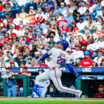
City Connect, via the New York Mets
Michael Mayer
After seeing what other teams have done, I would say the Mets have one of the better City Connects. I loved some of the attention to detail and how they tied in important stuff from the area. My biggest gripe is that I thought they should’ve used more purple. Overall, though, it was well done, and the videos/photos they used to release the City Connects were well done, too.
Michael Lloyd
I’m actually impressed…it’s a thrill when your favorite team drops a new uniform. Even more impressive is when you look across the spectrum of previous City Connect uniforms released for other teams… the Mets version is top-notch.
Michelle Ioannou
I get it’s the CITY Connect jerseys. I get the Mets are representing NYC and I love that. But I’ll admit it – I do wish it said Queens. And yes, I’ll also admit that as a born and raised Queens gal, I am very Queens biased. With that being said, I am a fan of the hints of purple rather than the rumors of it having a ton of purple. I also love the hat with the Queensboro Bridge. All in all, I don’t hate them, and they could’ve been way worse.


