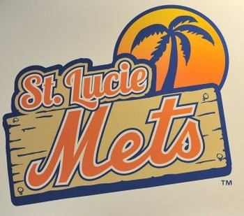
The St. Lucie Mets unveiled their new logo on Monday in an afternoon full of pomp and circumstance. Okay, you can ditch that last part, I just always wanted to use those words in a sentence about the Mets. 🙂

“It’s a fresh look. We thought it was a good time with our 25th anniversary coming up in 2013, and it was a good opportunity,” said Paul Taglieiri, the New York Mets’ Director of Florida Operations “We wanted to stay with what the big club was doing and also add our own touches to it.
“I love the orange. We moved the black away from the uniform, and it really has a Florida look to it. And I love Florida Mr. Met — it gives us our own identity as our own team.”
Mr. Met in a Hawaiian Shirt, sunglasses and flip-flops? You gotta love it…
I like the new look, it’s kind of fun and you still have the Mets colors, but now with more orange… Hey it’s Florida… Oranges over there are like bagels here in New York.
Okay, I’m ready for breakfast…


