How did you fill the baseball void during the lockout? Anguish/revel in the Giants and Jets seasons? Play MLB The Show? Watch Game 6 of the 1986 World Series on a loop? Maybe pursuing through Met yearbooks one of your activities. Personally, I found a few of the covers simple, yet aesthetically pleasing (even if the team itself wouldn’t be that way) and others less appealing to the eyes (thus a perfect metaphor for the team’s fortunes).
Here are some that stand out, for better or worse:
1962

Easily the most famous. And probably the best. The birth of New York’s newest National League franchise is symbolized perfectly. Unfortunately, you won’t find this for 50 cents on eBay.
1969

This would have been near perfect if not for the disembodied heads of Koosman, Grote, and Seaver floating in the sky. All that matters was the perfect ending on the field.
1970
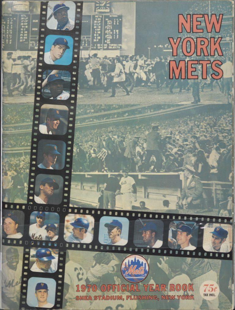
Back when film strips were a thing…a year like 1969 is impossible not to cap and makes for a lot of material. Much of those memories (and those who made them) are here.
1974

Unlike the 1970 edition, this one succeeds because of its simplicity. A close-up shot of the 1973 pennant overlooking Shea Stadium. One of my favorites.
1986

The early 80s was the worst period — a revival of cartoon-themed covers, including the especially-busy 1981 edition (manager Joe Torre cooking up “a recipe for Mets magic”). Contrast that one to this. Very simple yet very unique — and a memorable year for sure.
1987

There are two versions to commemorate the World Series championship afterglow, but we’ll go with the mural of memories from the remarkable ’86 postseason. I would have liked this more if it was less a mural and more of a photo collage, although it still works.
1997

It’s so bad it’s kind of good. I can’t tell you how many times I went back and forth tilting the yearbook with the hologram of Todd Hundley’s single-season record-setting 41st home run. For entertainment value, this wins in a runaway.
2001

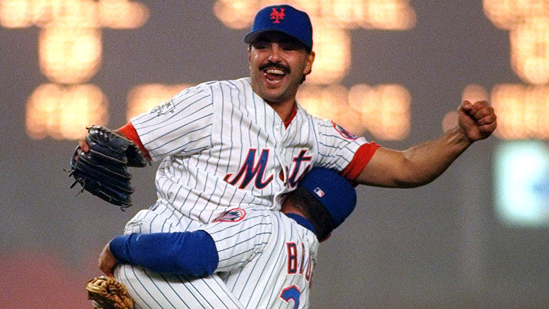
It’s easy to love the ones that celebrate the championships. What makes this one stand out (in addition to every player on here wearing black uniforms) is John Franco following the 2000 NLCS win over the Cardinals.
2008

I never really cared for the looks of 2002 through ’07 for some reason, but it made a comeback in 2008 to celebrate the final year at Shea with a split-screen sketch of the ballpark — half the original outer facing and half the remodeled look.
2012-13

Why go with a single cover when you can have 50? A half-century of yearbooks is encompassed in the 2012 design. It starts a collage-heavy trend that has more or less continued through 2021. The next season’s (not pictured), in tribute to that July’s midsummer classic at Citi Field, has all 48 players which have represented the Mets in an All-Star Game.
2020

The recent editions lack a lot of variety. However, the player collages — whether they are action shots or poses — are all well done. Just a personal preference, but 2020 is my favorite of the last seven years: Jacob deGrom and Pete Alonso at the top, J.D. Davis and Michael Conforto’s walk-off exhilarations from August ’19, with Amed Rosario sliding in below.
This year’s marking of the 60th anniversary will likely away from the latest trend and have a historical slant. The logo is a beauty, so if the Mets artistic team continues to be on point the yearbook should follow suit.


